
Android Studio Button Tutorials with Examples
A button is a GUI component that consists of text or an image. Buttons are used to perform events and actions such as click events, touch events, by the user.
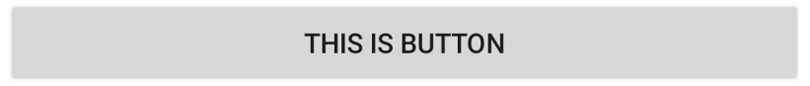
Example of Button in XML
        <?xml version="1.0" encoding="utf-8"?>
        <LinearLayout xmlns:android="http://schemas.android.com/apk/res/android"
            xmlns:tools="http://schemas.android.com/tools"
            android:layout_width="match_parent"
            android:layout_height="match_parent"
            android:gravity="center"
            tools:context=".TestActivity">


            <Button
                android:layout_width="wrap_content"
                android:layout_height="wrap_content"
                android:text="This is Button" />

            <!--If you are using AndroidX then use below code create a button-->
            <androidx.appcompat.widget.AppCompatButton
                android:layout_width="wrap_content"
                android:layout_height="wrap_content"
                android:text="This is Button"
                android:visibility="gone" />

        </LinearLayout>
Attributes of Button
android:layout_width - This attribute is used to set width of the Button. It is required attribute.
Values of layout_width attribute :
match_parent : It will set Button's width according to the parent layout's width. For example, if width of the parent layout is 200dp then width of the Button is also considered as 200dp.
wrap_content : It will automatically adjust width of the Button according to the text length. Button's width will increase or decrease when length of text is changed.
other : You can also set width in dp or px like 200dp, 50px, etc.
android:layout_height - This attribute is used to set height of the button. It is required attribute.
Values of layout_height attribute :
match_parent : It will set Button's height according to the parent layout's height. For example, if height of the parent layout is 200dp then height of the Button is also considered as 200dp.
wrap_content : It will automatically adjust height of the Button according to the number of text lines. Button's width will increase or decrease when the number of lines are changed
other : You can also set height in dp or px like 200dp, 50px, etc.
Button Margin Attributes
        <androidx.appcompat.widget.AppCompatButton
            android:layout_width="match_parent"
            android:layout_height="wrap_content"

            android:layout_marginStart="50dp"
            android:layout_marginTop="20dp"
            android:layout_marginEnd="50dp"
            android:layout_marginBottom="10dp"

            android:text="This is Button" />
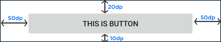
android:layout_marginStart - This attribute is used to give extra space from left side of the Button.
Values of layout_marginStart attribute :
You can set value in dp or px like 20dp, 50px, etc.
android:layout_marginEnd - This attribute is used to give extra space from right side of the Button.
Values of layout_marginEnd attribute :
You can set value in dp or px like 20dp, 50px, etc.
android:layout_marginTop - This attribute is used to give extra space from top of the Button.
Values of layout_marginTop attribute :
You can set value in dp or px like 20dp, 50px, etc.
android:layout_marginBottom - This attribute is used to give extra space from bottom of the Button.
Values of layout_marginBottom attribute :
You can set value in dp or px like 20dp, 50px, etc.
android:layout_margin - This attribute is used to give extra space from every side (left, right, top, bottom) of the Button.
Values of layout_margin attribute :
You can set value in dp or px like 20dp, 50px, etc.
Button Padding Attributes
        <androidx.appcompat.widget.AppCompatButton
            android:layout_width="wrap_content"
            android:layout_height="wrap_content"

            android:paddingStart="50dp"
            android:paddingEnd="30dp"
            android:paddingTop="50dp"
            android:paddingBottom="30dp"

            android:text="This is Button" />
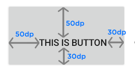
android:paddingStart - This attribute is used to give inside space between text and left side of the Button edge.
Values of paddingStart attribute :
You can set value in dp or px like 20dp, 50px, etc.
android:paddingEnd - This attribute is used to give inside space between text and right side of the Button edge.
Values of paddingEnd attribute :
You can set value in dp or px like 20dp, 50px, etc.
android:paddingTop - This attribute is used to give inside space between text and top side of the Button edge.
Values of paddingTop attribute :
You can set value in dp or px like 20dp, 50px, etc.
android:paddingBottom - This attribute is used to give inside space between text and bottom side of the Button edge.
Values of paddingBottom attribute :
You can set value in dp or px like 20dp, 50px, etc.
android:padding - This attribute is used to give inside space between text and every side of the Button edge.
Values of padding attribute :
You can set value in dp or px like 20dp, 50px, etc.
Button Text Style Attributes
android:text - This attribute is used to write text on the Button.
        <androidx.appcompat.widget.AppCompatButton
            android:layout_width="wrap_content"
            android:layout_height="wrap_content"
            android:text="This is text on button"/>
Values of text attribute :
You can set any String value like "Learnoset", "Coding", "Android", etc.
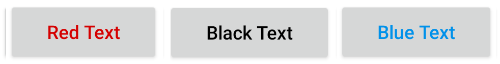
android:textColor - This attribute is used to change text color of the Button.
        <androidx.appcompat.widget.AppCompatButton
            android:layout_width="wrap_content"
            android:layout_height="wrap_content"
            android:textColor="#D50000"
            android:text="Red Text"/>
Values of textColor attribute :
You can use color codes like "#000000", "#FFFFFF", etc. You can also get color values from colors.xml file like "@color/black"
android:textSize - This attribute is used to change text size of the Button.
        <androidx.appcompat.widget.AppCompatButton
            android:layout_width="wrap_content"
            android:layout_height="wrap_content"
            android:textSize="18sp"
            android:text="Text size 18sp"/>
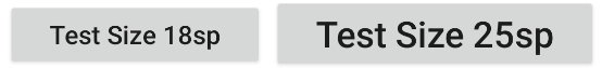
Values of textSize attribute :
You can set text size in dp, px, sp like 10dp, 20px, 18sp, etc.
android:textStyle - This attribute is used to set Button's text style like bold, italic, normal.
        <androidx.appcompat.widget.AppCompatButton
            android:layout_width="wrap_content"
            android:layout_height="wrap_content"
            android:textStyle="bold"
            android:text="Bold Text"/>

        <androidx.appcompat.widget.AppCompatButton
            android:layout_width="wrap_content"
            android:layout_height="wrap_content"
            android:textStyle="italic"
            android:text="Italic Text"/>

        <androidx.appcompat.widget.AppCompatButton
            android:layout_width="wrap_content"
            android:layout_height="wrap_content"
            android:textStyle="normal"
            android:text="Normal Text"/>
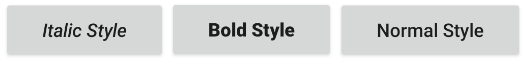
Values of textStyle attribute :
bold : To make text bold
italic : To make text italic
normal : To make text normal (remove italic and bold style)
combined : You can also use multiple values like bold | italic by using '|' symbol in between.
android:textAllCaps - This attribute is used to make text in UPPERCASE or lowercase.
        <androidx.appcompat.widget.AppCompatButton
            android:layout_width="wrap_content"
            android:layout_height="wrap_content"
            android:textAllCaps="true"
            android:text="Uppercase Text"/>

        <androidx.appcompat.widget.AppCompatButton
            android:layout_width="wrap_content"
            android:layout_height="wrap_content"
            android:textAllCaps="false"
            android:text="Lowercase Text"/>
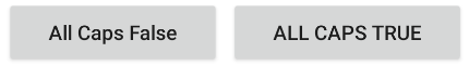
Values of textAllCaps attribute :
true : Text in uppercase
false : Text in lowercase
Button Other Attributes
android:background - This attribute is used to set background of a Button
        <androidx.appcompat.widget.AppCompatButton
            android:layout_width="wrap_content"
            android:layout_height="wrap_content"
            android:textAllCaps="true"
            android:background="#D50000"
            android:text="Red background"/>

Values of background attribute :
You can use a color as Button background like "#000000", "#FFFFFF", @color/black
You can also use an image from drawable folder as Button background like @drawable/you_image_name
android:drawableStart - This attribute is used set an image on left side of a Button
        <androidx.appcompat.widget.AppCompatButton
            android:layout_width="wrap_content"
            android:layout_height="wrap_content"
            android:drawableStart="@mipmap/ic_launcher"
            android:text="Drawable Start"/>
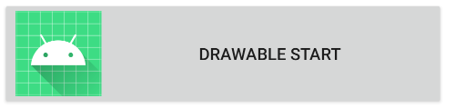
Values of drawableStart attribute :
You can also use an image from drawable folder like @drawable/you_image_name
Note: Use small images with resolution of 24px or 36px.
android:drawableEnd - This attribute is used set an image on right side of a Button
        <androidx.appcompat.widget.AppCompatButton
            android:layout_width="wrap_content"
            android:layout_height="wrap_content"
            android:drawableEnd="@mipmap/ic_launcher"
            android:text="Drawable End"/>
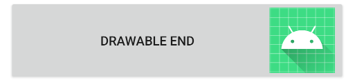
Values of drawableEnd attribute :
You can also use an image from drawable folder like @drawable/you_image_name
Note: Use small images with resolution of 24px or 36px.
android:drawableTop - This attribute is used set an image on top side of a Button
        <androidx.appcompat.widget.AppCompatButton
            android:layout_width="wrap_content"
            android:layout_height="wrap_content"
            android:drawableTop="@mipmap/ic_launcher"
            android:text="Drawable Top"/>

Values of drawableTop attribute :
You can also use an image from drawable folder like @drawable/you_image_name
Note: Use small images with resolution of 24px or 36px.
android:drawableBottom - This attribute is used set an image on bottom side of a Button
        <androidx.appcompat.widget.AppCompatButton
            android:layout_width="wrap_content"
            android:layout_height="wrap_content"
            android:drawableBottom="@mipmap/ic_launcher"
            android:text="Drawable Bottom"/>

Values of drawableBottom attribute :
You can also use an image from drawable folder like @drawable/you_image_name
Note: Use small images with resolution of 24px or 36px.
Code Examples
layout/activity_main.xml
<?xml version="1.0" encoding="utf-8"?>
<LinearLayout xmlns:android="http://schemas.android.com/apk/res/android"
    xmlns:tools="http://schemas.android.com/tools"
    android:layout_width="match_parent"
    android:layout_height="match_parent"
    android:orientation="vertical"
    tools:context=".MainActivity">

    <androidx.appcompat.widget.AppCompatButton
        android:id="@+id/normalButton"
        android:layout_width="wrap_content"
        android:layout_height="wrap_content"
        android:layout_gravity="center"
        android:layout_marginTop="20dp"
        android:background="@color/black"
        android:text="Normal Button with Black Background + White Text"
        android:textColor="#FFFFFF" />

    <androidx.appcompat.widget.AppCompatButton
        android:layout_width="wrap_content"
        android:layout_height="wrap_content"
        android:layout_gravity="center"
        android:layout_marginTop="20dp"
        android:background="@drawable/round_corner_button"
        android:text="Button with Round Corner" />

    <androidx.appcompat.widget.AppCompatButton
        android:layout_width="100dp"
        android:layout_height="100dp"
        android:layout_gravity="center"
        android:layout_marginTop="20dp"
        android:background="@drawable/round_button"
        android:text="Round Button" />

    <androidx.appcompat.widget.AppCompatButton
        android:layout_width="100dp"
        android:layout_height="100dp"
        android:layout_gravity="center"
        android:layout_marginTop="20dp"
        android:background="@drawable/button_click_effect"
        android:text="Button with click effect" />

    <androidx.appcompat.widget.AppCompatButton
        android:layout_width="wrap_content"
        android:layout_height="wrap_content"
        android:layout_gravity="center"
        android:layout_marginTop="20dp"
        android:background="@drawable/button_bottom_shadow"
        android:paddingStart="20dp"
        android:paddingEnd="20dp"
        android:text="Button with Bottom Shadow" />

    <androidx.appcompat.widget.AppCompatButton
        android:layout_width="wrap_content"
        android:layout_height="wrap_content"
        android:layout_gravity="center"
        android:layout_marginTop="20dp"
        android:background="@drawable/round_corner_2"
        android:paddingStart="20dp"
        android:paddingEnd="20dp"
        android:text="Button with Round Corner" />
</LinearLayout>
drawable/button_bottom_shadow.xml
<?xml version="1.0" encoding="utf-8"?>
<layer-list xmlns:android="http://schemas.android.com/apk/res/android">
    <item>
        <shape android:shape="rectangle">

            <!--Button Color-->
            <solid android:color="#80000000" />

            <corners android:radius="10dp" />
        </shape>
    </item>
    <item android:bottom="5dp">
        <shape android:shape="rectangle">

            <!--Button Color-->
            <solid android:color="@color/teal_200" />

            <corners android:radius="10dp" />
        </shape>
    </item>
</layer-list>
drawable/button_click_effect.xml
<?xml version="1.0" encoding="utf-8"?>
<ripple xmlns:android="http://schemas.android.com/apk/res/android"
    xmlns:tools="http://schemas.android.com/tools"
    android:color="@color/white"
    tools:targetApi="lollipop">

    <!--this creates the mask with the ripple effect-->
    <item
        android:id="@+id/mask"
        android:drawable="@color/teal_200" />

</ripple>
drawable/round_button.xml
<?xml version="1.0" encoding="utf-8"?>
<shape xmlns:android="http://schemas.android.com/apk/res/android"
    android:shape="rectangle">

    <!--Button Color-->
    <solid android:color="@color/teal_200" />

    <corners android:radius="1000dp"/>
</shape>
drawable/round_corner2.xml
<?xml version="1.0" encoding="utf-8"?>
<shape xmlns:android="http://schemas.android.com/apk/res/android"
    android:shape="rectangle">

    <!--Button Color-->
    <solid android:color="@color/teal_200" />

    <!---Make Round Corner with radius. you can increase or decrease radius according to your need-->
    <corners android:radius="100dp"/>
</shape>
drawable/round_corner_button.xml
<?xml version="1.0" encoding="utf-8"?>
<shape xmlns:android="http://schemas.android.com/apk/res/android"
    android:shape="rectangle">

    <!--Button Color-->
    <solid android:color="@color/teal_200" />

    <!---Make Round Corner with radius. you can increase or decrease radius according to your need-->
    <corners android:radius="10dp"/>
</shape>
MainActivity.java
import android.os.Bundle;
import android.view.View;
import android.widget.Toast;

import androidx.appcompat.app.AppCompatActivity;
import androidx.appcompat.widget.AppCompatButton;

public class MainActivity extends AppCompatActivity {

    @Override
    protected void onCreate(Bundle savedInstanceState) {
        super.onCreate(savedInstanceState);
        setContentView(R.layout.activity_main);

        // getting button reference from xml file through button id (normalButton)
        final AppCompatButton normalButton = findViewById(R.id.normalButton);

        // handle button click events
        normalButton.setOnClickListener(new View.OnClickListener() {
            @Override
            public void onClick(View view) {

                // write your code here to perform after the button is clicked
                // For example, show Toast message
                Toast.makeText(MainActivity.this, "Button Clicked", Toast.LENGTH_SHORT).show();
            }
        });
    }
}
Output

If you have any Questions or Queries
You can mail us at info.learnoset@gmail.com
Follow us to learn Coding and get in touch with new Technologies.