
Android Studio EditText Tutorials with Examples
EditText is a UI component that is used to get inputs from a user. An input could be in any form like digits, alphabets, etc.
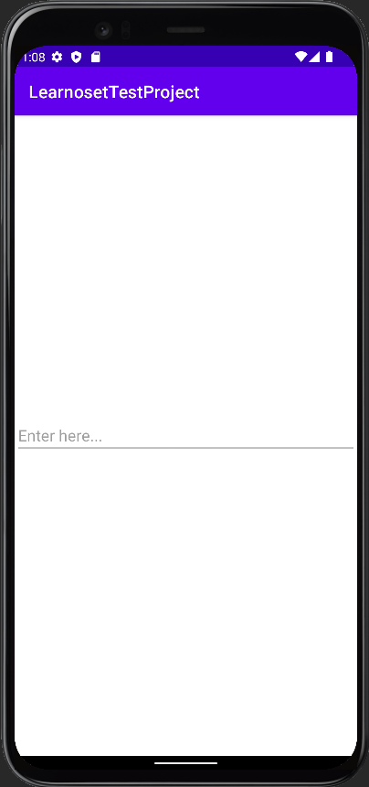
Example of EditText in XML
        <LinearLayout xmlns:android="http://schemas.android.com/apk/res/android"
            xmlns:tools="http://schemas.android.com/tools"
            android:layout_width="match_parent"
            android:layout_height="match_parent"
            android:orientation="vertical"
            android:gravity="center"
            tools:context=".MainActivity">

            <EditText
                android:id="@+id/editText"
                android:layout_width="match_parent"
                android:layout_height="wrap_content"
                android:hint="Enter here..." />
        </LinearLayout>
Attributes of EditText
android:layout_width - This attribute is used to set width of the EditText. It is required attribute.
Values of layout_width attribute :
match_parent : It will set EditText's width according to the parent layout's width. For example, if width of the parent layout is 200dp then width of the EditText is also considered as 200dp.
wrap_content : It will automatically adjust width of the EditText according to the text length. EditText's width will increase or decrease when length of text is changed
other : You can also set width in dp or px like 200dp, 50px, etc.
android:layout_height - This attribute is used to set height of the EditText. It is required attribute.
Values of layout_height attribute :
match_parent : It will set EditText's height according to the parent layout's height. For example, if height of the parent layout is 200dp then height of the EditText is also considered as 200dp.
wrap_content : It will automatically adjust height of the EditText according to the number of text lines. EditText's width will increase or decrease when the number of lines are changed
other : You can also set height in dp or px like 200dp, 50px, etc.
EditText Margin Attributes
        <EditText
            android:id="@+id/editText"
            android:layout_width="match_parent"
            android:layout_height="wrap_content"

            android:layout_marginStart="20dp"
            android:layout_marginEnd="20dp"
            android:layout_marginTop="20dp"
            android:layout_marginBottom="50dp"

            android:hint="Enter here..." />
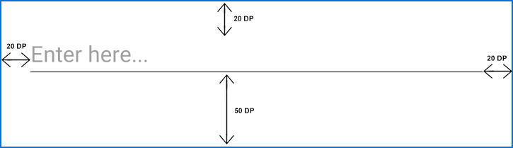
android:layout_marginStart - This attribute is used to give extra space from left side of the EditText.
Values of layout_marginStart attribute :
You can set value in dp or px like 20dp, 50px, etc.
android:layout_marginEnd - This attribute is used to give extra space from right side of the EditText.
Values of layout_marginEnd attribute :
You can set value in dp or px like 20dp, 50px, etc.
android:layout_marginTop - This attribute is used to give extra space from top of the EditText.
Values of layout_marginTop attribute :
You can set value in dp or px like 20dp, 50px, etc.
android:layout_marginBottom - This attribute is used to give extra space from bottom of the EdtText.
Values of layout_marginBottom attribute :
You can set value in dp or px like 20dp, 50px, etc.
android:layout_margin - This attribute is used to give extra space from every side (left, right, top, bottom) of the EditText.
Values of layout_margin attribute :
You can set value in dp or px like 20dp, 50px, etc.
EditText Padding Attributes
        <EditText
            android:id="@+id/editText"
            android:layout_width="match_parent"
            android:layout_height="wrap_content"

            android:paddingStart="20dp"
            android:paddingEnd="40dp"
            android:paddingTop="50dp"
            android:paddingBottom="60dp"

            android:hint="Enter here..." />
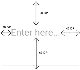
android:paddingStart - This attribute is used to give inside space between text and left side of EditText edge.
Values of paddingStart attribute :
You can set value in dp or px like 20dp, 50px, etc.
android:paddingEnd - This attribute is used to give inside space between text and right side of EditText edge.
Values of paddingEnd attribute :
You can set value in dp or px like 20dp, 50px, etc.
android:paddingTop - This attribute is used to give inside space between text and top side of EditText edge.
Values of paddingTop attribute :
You can set value in dp or px like 20dp, 50px, etc.
android:paddingBottom - This attribute is used to give inside space between text and bottom side of EditText edge.
Values of paddingBottom attribute :
You can set value in dp or px like 20dp, 50px, etc.
android:padding - This attribute is used to give inside space between text and every side of EditText edge.
Values of padding attribute :
You can set value in dp or px like 20dp, 50px, etc.
EditText Text Style Attributes
android:text - This attribute is used to write text in the EditText.
        <EditText
            android:id="@+id/editText"
            android:layout_width="wrap_content"
            android:layout_height="wrap_content"
            android:text="This is text"/>
Values of text attribute :
You can set any String value like "Learnoset", "Coding", "Android", etc.
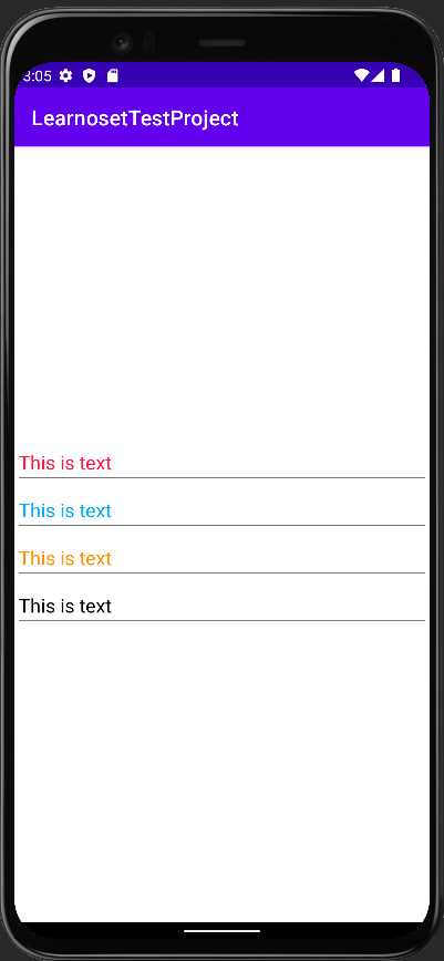
android:textColor - This attribute is used to change text color of the EditText.
        <EditText
            android:id="@+id/editText"
            android:textColor="@color/teal_200"
            android:layout_width="wrap_content"
            android:layout_height="wrap_content"
            android:text="This is text"/>
Values of textColor attribute :
You can use color codes like "#000000", "#FFFFFF", etc. or you can also get value from colors.xml file like "@color/black"
android:textSize - This attribute is used to change text size of the EditText.
        <EditText
            android:textColor="#FF1744"
            android:layout_width="match_parent"
            android:layout_height="wrap_content"
            android:text="This is text"
            android:textSize="20sp"/>
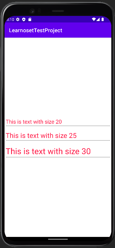
Values of textSize attribute :
You can set text size in dp, px, sp like 10dp, 20px, 18sp, etc.
android:textStyle - This attribute is used to set style of EditText like bold, italic.
        <EditText
            android:layout_width="match_parent"
            android:layout_height="wrap_content"
            android:text="This is text with normal style"
            android:textSize="20sp"
            android:textStyle="normal" />

        <EditText
            android:layout_width="match_parent"
            android:layout_height="wrap_content"
            android:text="This is text with bold style"
            android:textSize="20sp"
            android:textStyle="bold" />

        <EditText
            android:layout_width="match_parent"
            android:layout_height="wrap_content"
            android:text="This is text with italic style"
            android:textSize="20sp"
            android:textStyle="italic" />

        <EditText
            android:layout_width="match_parent"
            android:layout_height="wrap_content"
            android:text="This is text with bold and italic style"
            android:textSize="20sp"
            android:textStyle="bold|italic" />
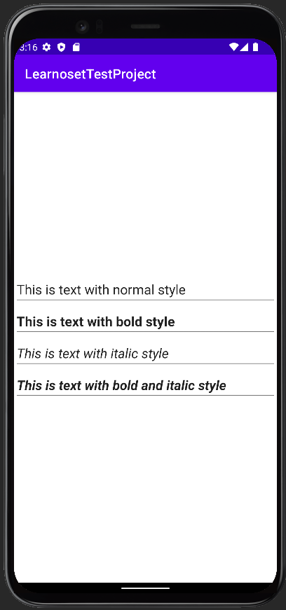
Values of textStyle attribute :
bold : To make text bold
italic : To make text italic
normal : To make text normal (remove italic and bold style)
combined : You can also use multiple values like bold | italic by using '|' symbol in between.
EditText Other Attributes
android:background - This attribute is used to set background of the EditText
        <EditText
            android:layout_width="match_parent"
            android:layout_height="50dp"
            android:background="@android:color/holo_red_light"
            android:text="EditText with Red Background"
            android:textSize="20sp"
            android:textStyle="normal" />

        <EditText
            android:layout_width="match_parent"
            android:layout_height="50dp"
            android:layout_marginTop="20dp"
            android:background="@android:color/holo_blue_dark"
            android:text="EditText with Blue Background"
            android:textSize="20sp"
            android:textStyle="normal" />

        <EditText
            android:layout_width="match_parent"
            android:layout_height="50dp"
            android:layout_marginTop="20dp"
            android:background="@android:color/holo_orange_dark"
            android:text="EditText with Orange Background"
            android:textSize="20sp"
            android:textStyle="normal" />
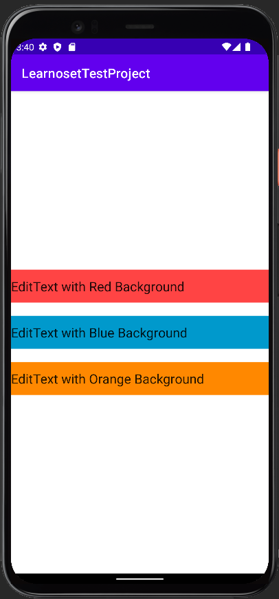
Values of background attribute :
You can use a color as EditText's background like "#000000", "#FFFFFF", @color/black
You can also use an image from drawable folder as EditText's background like @drawable/you_image_name
android:hint - This attribute is used as a placeholder. It specifies usages of the EditText
            <EditText
                android:layout_width="match_parent"
                android:layout_height="50dp"
                android:hint="This is Hint" />
Values of hint attribute :
You can use a string value like "Learnoset", "Phone", "Mobile" etc.
android:inputType - This attribute is used to set what type of value (digits or alphabets) is accepted by the EditText
            <EditText
                android:layout_width="match_parent"
                android:layout_height="50dp"
                android:hint="Enter Full Name"
                android:inputType="text" />

            <EditText
                android:layout_width="match_parent"
                android:layout_height="50dp"
                android:hint="Enter Phone"
                android:inputType="number" />

            <EditText
                android:layout_width="match_parent"
                android:layout_height="50dp"
                android:hint="Enter Email"
                android:inputType="textEmailAddress" />
Values of inputType attribute :
text : EditText will accept any type of value
number : EditText will accept only number values (0-9)
textEmailAddress : EditText will accept email address
phone : EditText will accept phone numbers
textPassword : text will show as dots. User can enter password in both numbers and alphabets
numberPassword : text will show as dots. User can enter password in numbers
android:gravity - This attribute is used to align text to left, right, top, bottom, center, etc.
            <EditText
                android:layout_width="match_parent"
                android:layout_height="50dp"
                android:gravity="start"
                android:text="Left Text" />
Values of gravity attribute :
You can set value start, end, top, bottom, center, center_vertically, center_horizontally, etc.
If you have any Questions or Queries
You can mail us at info.learnoset@gmail.com
Follow us to learn Coding and get in touch with new Technologies.